HERZBLUT
Marken Erscheinungsbild, Flaschenetikett
Brand appearance, bottle label
Marken Erscheinungsbild, Flaschenetikett
Brand appearance, bottle label
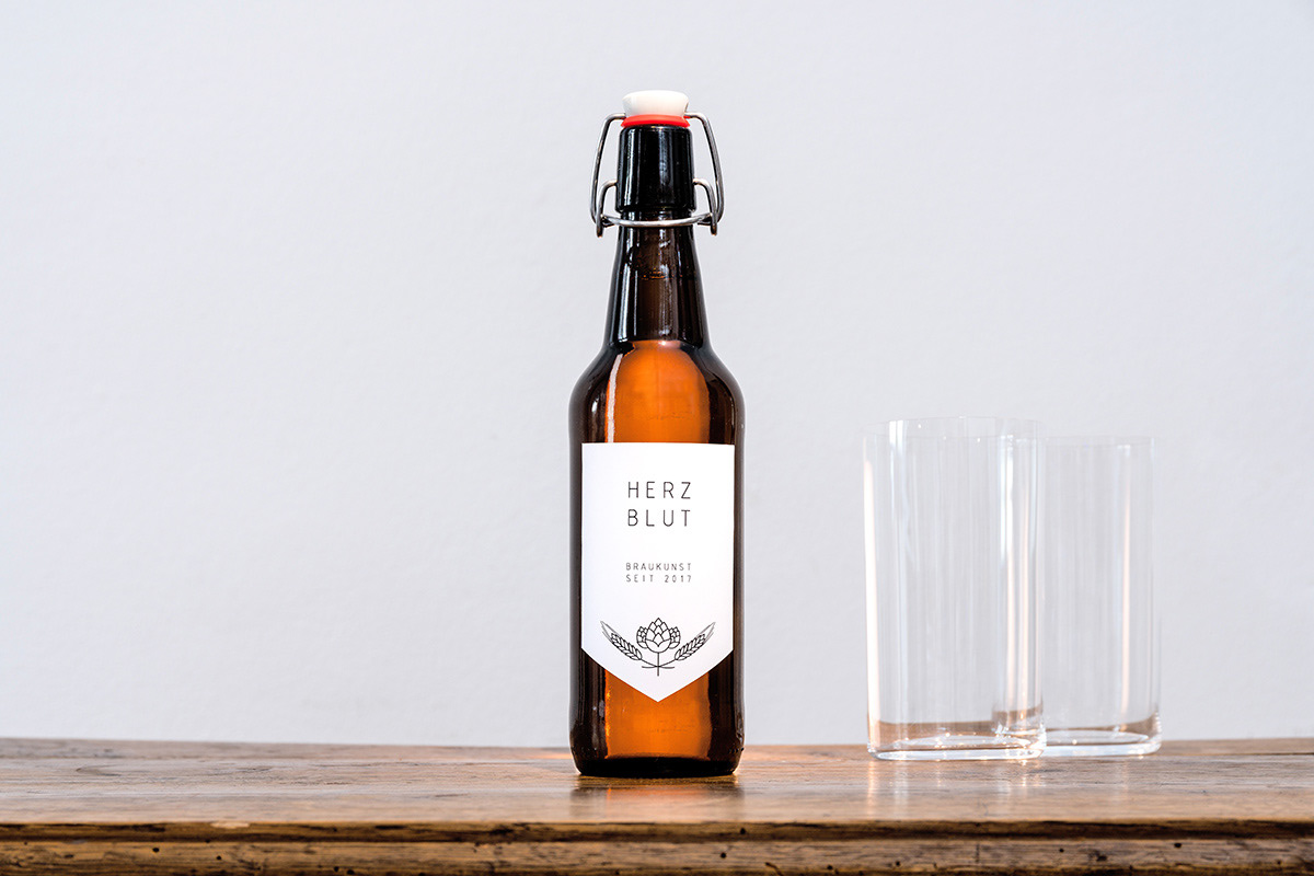
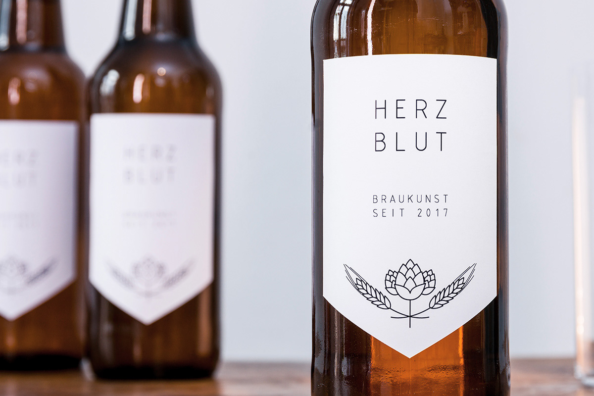
Die noch junge Bier Manufaktur Herzblut stellt traditionell gebrautes Bier in kleinen Auflagen her und vertreibt es direkt. Für ihre ersten Tastings und kleineren Auflagen wollten sie der Marke bereits ein Gesicht geben, das sich von den am Markt befindenden Unternehmen unterscheidet. Passend zum puristischen Ansatz von Herzblut gestalteten wir ein schlichtes, weißes Etikett mit zurückhaltendem Logo und Strichgrafik der geschmackgebenden Inhaltsstoffe, welches dem traditionellen Handwerk ein kontemporäres Erscheinungsbild gibt und der urigen Braunglasflasche mit Bügelverschluss einen schönen Kontrast entgegensetzt.
Wir sind gespannt wie Herzblut sich weiter entwickelt und werden die Marke auch in Zukunft gestalterisch unterstützen.
Wir sind gespannt wie Herzblut sich weiter entwickelt und werden die Marke auch in Zukunft gestalterisch unterstützen.
The still young beer manufacturer Herzblut produces traditionally brewed beer in small editions and sells it directly. For their first tastings and smaller editions, they wanted to give the brand a face that is different from those on the market. In keeping with the purist approach of Herzblut we designed a simple, white label with restrained logo and line art of the taste-giving ingredients, which gives the traditional craft a contemporary appearance and opposes a beautiful contrast to the rustic amber glass bottle with clip closure.
We are curious how Herzblut will develop and will continue supporting the brand in future design questions.
Entwurf/Design: Anna Leyerer, Christof Spath
Fotos/Pictures: Kristof Lemp
Fotos/Pictures: Kristof Lemp